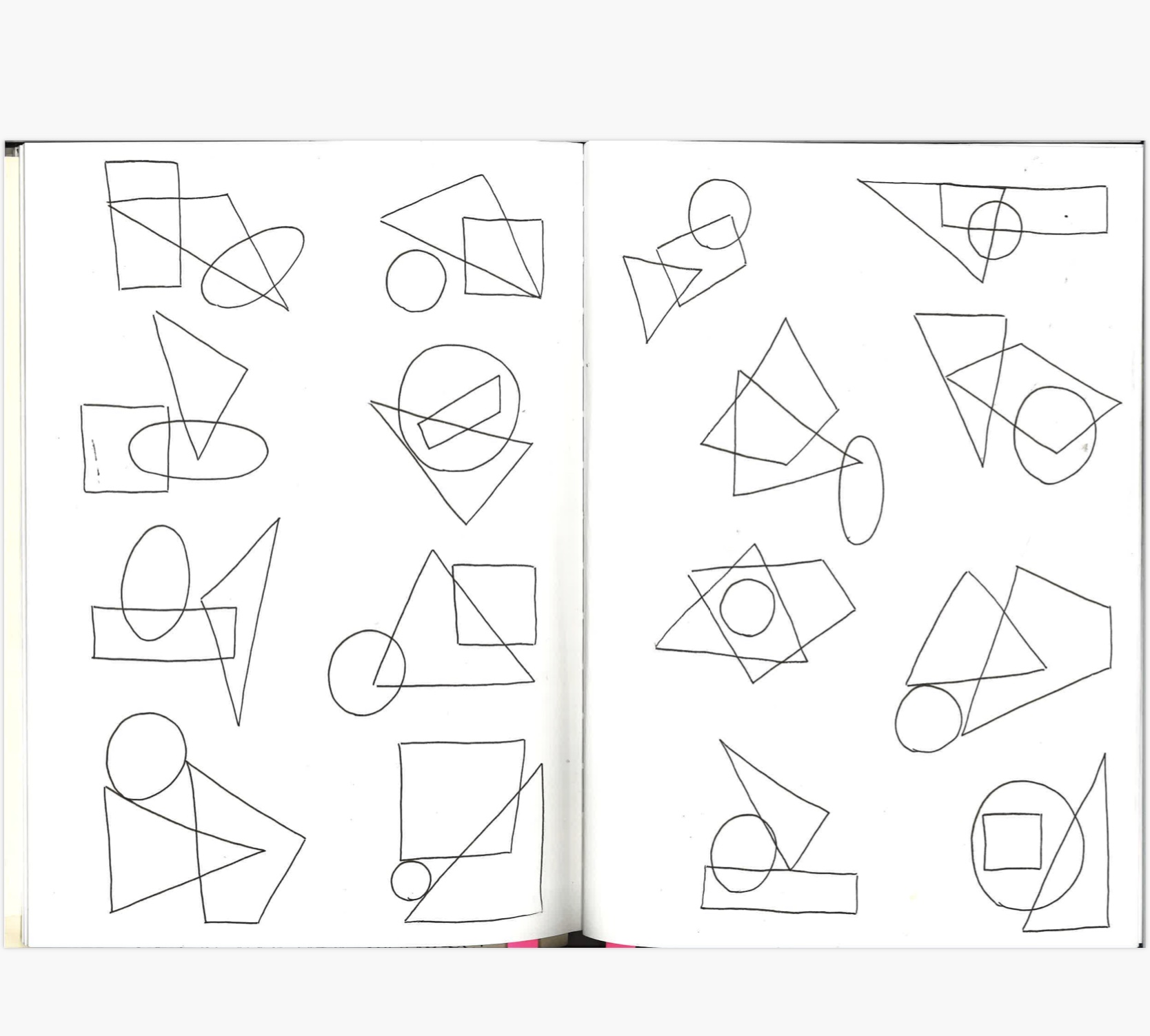
Sketchbook work: working within the boundaries and restrictions of shapes- more specifically: circles, squares and triangles. Experimenting with the variety of ways you can play with these shapes: overlapping, cutting out, drawing, collating, forming other shapes and letters… the possibilities are endless once you start experimenting. Eventually you find that the once specific shapes become unrecognisable- you’re looking at new formations that coupled be plans for a sculpture, architecture, portraits, figure drawings. As David Carson said, “don’t mistake legibility for communication”.
I found this process quite therapeutic. Working within the limitations of only using circles, squares and triangles was initially challenging- but you start to break out of that confinement, whilst still maintains the limit of the specific shapes.


Forming letters out of circles, squares and triangles. After experimenting in the sketchbook, I developed this practice of still using specific shapes to form the letter Y- playing with a more typographical approach. I chose the letter Y because I liked the dimensions you could play with. In my opinion it felt like a fun letter to work with- it’s facing a variety of directions, it could take on the form of a body, or a tree- any abstract figure. I decided to incorporate all three shapes in an alternating pattern. Playing with negative spaces allowed me to create an almost 3D effect in this design- hinting at an idea of light behind the letter. Once the design was finalised, I inverted it using the photocopier- creating a negative version. I personally prefer this version- it creates a whole different effect.
Developing this idea further, once the design was finished it was printed onto acetate to prepare a screen for screen printing. Screen printing was a process I hadn’t had much experience in previously- so this project taught me a lot about the techniques and capabilities of the medium. I entered this process with an open mind, not too sure about how the final prints would look. I was sure about my colour scheme, however: deciding on contrasting colours that complement one another. The brightness of the neon green accentuates the darker purple- which in turn highlight the shape of the letter. I was pleased with the final composition of these prints- playing with these colours allowed me to play with motion and gradual merging of the two colours. Thus you begin to see a journey from cleaner, crisper lines to marbled patterns in the background of the letter.


Another part of this project involved making a zine. This zine is also a mark of a journey: it began as a group collaboration, drawing circles, squares and triangles on various A1 pieces of paper- which we would later claim and transform into zines. As you flick through the zine you can identify the different marks people made in their shapes. I decided to play with different layouts over the pages of my zine- cutting out shapes and placing collages imagery in the backgrounds. I also played with different themes: shattering, perception, disillusionment, and rules. The pages below illustrate my experiments with rule and perception- one black and white page illustrates various facial features, giving the impression of shattered glass, or mirrors. I wanted to play with an alternative canvas- limiting myself to staying inside the lines of the shapes. The other pages below demonstrate experimentations with a more graphic approach- focusing on words I felt were important to this particular project. DISINTEGRATION relates to the process of repeating something until it breaks, repetitive marks eventually become a completely new composition. Disintegration is a collage of a variety of conflicting colours and shapes cut out from magazines, on top of the drawn circles squared and triangles on the page, with the letters for DISINTEGRATION stuck diagonally down the page. The other page spread state FORM, BALANCE, STRUCTURE AND SHAPE: words I kept repeating in my mind whilst working within this project to constantly focus on compositions of shapes and layouts-thinking about the process but also how the outcome will look.


